
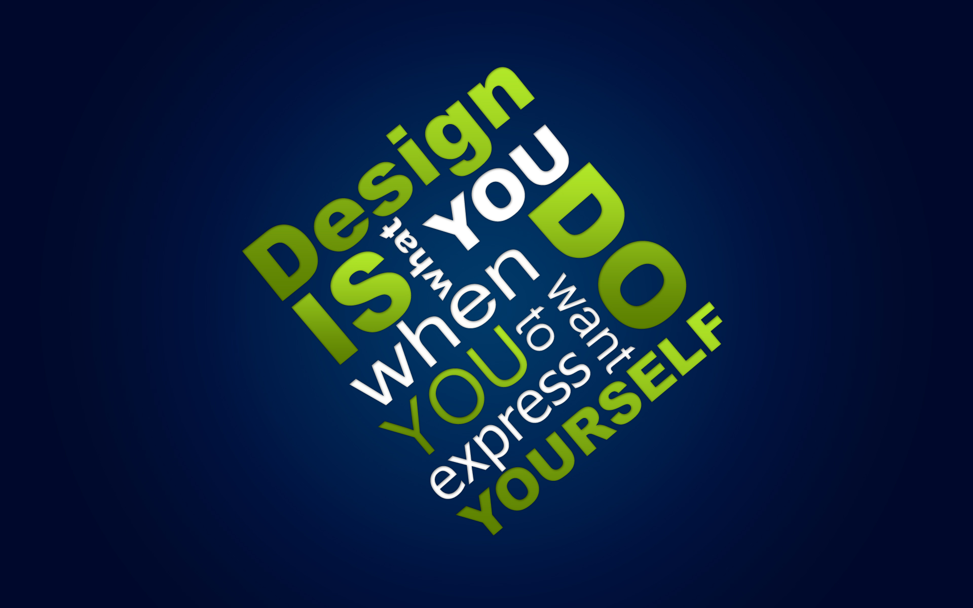
This InDesign tutorial will be less of a tutorial and more of a general collection of tips and tricks for applying effects to your text. If you are creating a banner or poster that needs a bold title, having a way to add effects to the text can be a great method of packing more of a punch into your design. There are many situations where some good type effects can be appropriate, and this InDesign CS5 tutorial can give you a few general ideas of how it’s done.
Effects
In a previous InDesign tutorial I discussed the effects panel in depth (link to this tutorial here). If you followed that one closely, you should have a basic understanding of the ins and outs of adding effects to text. I’ll recap a bit about that here, and then show you a bit more about how all this can be applied to text.
1. There are many effects that can be applied to your text, but it’s always best to remember that less is usually more. This is true in two ways. For one, apply the effects to smaller amounts of text rather than larger ones, and it will usually come out better. For another, applying the effects in a subtler manner almost always has a stronger effect, as the effect itself doesn’t overpower the message or design of the text.
 2. Embossing. Embossing is a technique commonly used to add a very dramatic feel to text. To apply it, use the Effects dialog. Under the option bevel and emboss you can find all sorts of changeable options, and you should play around with these to achieve a certain effect. In the screenshot below, I’ve given the text a basic inner bevel with a chisel hard technique.
 3. Shadows and glows. These effects are some of the most overused, but also some of the most important. A basic shadow or glow is very easy to add, but an interesting effect you can also achieve is to create text where only the shadow or glow is showing. To do this, simply uncheck the Object Knocks Out Shadow option. You’ll have to make the color of the text white and set it to Multiply so it becomes invisible.
 Gradients

Gradients come into play a great deal with objects, and much less with text. However adding a gradient to your text can be a great move, and something that your design will benefit from greatly. Here are a few InDesign tutorial tips:
1. You can add a gradient to text as simply as dragging with the gradient tool to apply it on your text. If you want to edit the gradient, you can easily do it with the gradients palette.
 2. If you want your text to have a gradient stroke, this is also simple. You’ll have to convert the text to outlines (so make sure you won’t want to do any more editing), then add a stroke. Use the gradient tool to apply the gradient. Through the effects dialog you can also add any one of the effects you like, and create a very nice overall look.
 Stay tuned for the next of my InDesign tutorials on type effects.
Pingback: InDesign Type Effects: Tips and Ideas Part 2 | InDesign Tutorials