One of the most commonly requested InDesign tutorials I’ve seen are from people asking how they can achieve a chrome effect in their text. Chrome effects can look quite dazzling when they are applied properly, and though it might seem like a hard look to achieve, it’s surprisingly simple. The following InDesign tutorial will take you through the steps involved in making a basic chrome effect, which you can then adapt to your needs later.
Creating the Gradient
Chrome is really just a simple gradient with a few effects added on afterwards to enhance the look. The gradient actually only requires a few colors, 3 stops to be exact, in order to look stylish and correct.
1. First things first: create a simple line of text. Format this text into a font that will look good and clearly display the effect. Something with thick lines will work best.
 2. Now pull out your gradient palette. It is here that the magic will happen. You’ll be creating a gradient that goes from light sharply to dark, then back to light again. That’s not quite a good explanation, so I’l,l show you a bit more in-depth.
3. Make the first color a light blue. This is the most common color found reflected in chrome surfaces, and it looks the best in most cases. (Like I said, this InDesign tutorial and the techniques found within it should be adapted according to your needs). The other end of the gradient should be white.
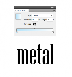 4. Drag the white to a bit less than the middle of the gradient slider. Now pull out another color marker before that one, and make it dark gray.
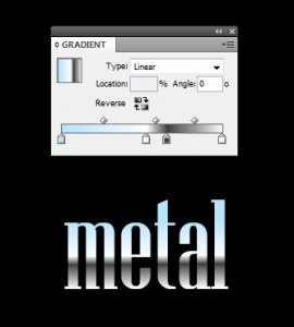
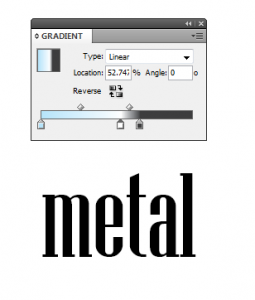 5. As you can see in the above screenshot, the gray and white have a very sharp contrast in a very small area. This is essentially what makes the chrome effect work. To round it out, pull out another marker at the end of the gradient and make it white. Your completed gradient should look like mine in the below screenshot.
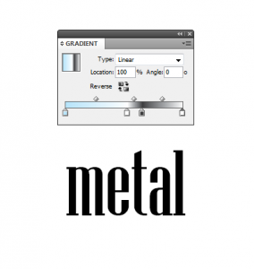 6. Now you can apply it to the text. Select the text with the text tool, and then drag with the gradient tool to apply it. I’ve also added a black background so the full effect can be seen.
 Effects
The text can, of course, be left as is. It looks really great, and by playing around with the colors and amounts in the gradients palette, you can completely change the look. If you want to add just a bit more, then a slight emboss and drop shadow with a bit of satin can make it look just right.
 The gradient technique you’ve learned in this tutorial can be a starting point for many other great gradient ideas and techniques. It also looks great applied to objects, so feel free to experiment.


